Visualisation & evidence design
Published work · every form the engine draws · the design rules behind both
One dataset, nine grammars.
Every figure below is drawn from the same source — UN Inter-agency Group for Child Mortality Estimation estimates for thirteen sub-Saharan series, fetched from the World Bank Indicators API.
Screening is not adjudication.
A plausibility screen flagged two spikes in the same series with identical statistics. One is a corrupt record. The other is the 1994 genocide against the Tutsi. No test distinguishes them, so every candidate is reviewed by a person and the reasoning is published rather than buried in a script.
Scroll the chart sideways to read it at full size.
Malawi cut under-five mortality by 80% in a generation.
From 243.5 to 49.6 deaths per 1,000 live births between 1990 and 2023 — a steeper decline than the sub-Saharan African average over the same period.
Scroll the chart sideways to read it at full size.
Almost half of those deaths now occur in the first 28 days.
Malawi's neonatal share of under-five deaths rose from 20% to 48%. As overall child mortality falls, the remaining burden concentrates in the newborn period.
Scroll the chart sideways to read it at full size.
Neonatal mortality has not moved since 2018.
Indexed to 1990, under-five mortality fell 80% while neonatal mortality fell 52% and has held at 23.8 per 1,000 for six consecutive years.
Scroll the chart sideways to read it at full size.
Where each country stands today.
Under-five mortality in 2023 across twelve countries and the regional aggregate, sorted by value so the ranking is read directly rather than inferred from bar lengths.
Scroll the chart sideways to read it at full size.
Every country improved. They did not improve equally.
1990 paired with 2023. Convergence is visible as slope, and the spread at the left edge collapses to a much narrower band at the right.
Scroll the chart sideways to read it at full size.
Rate of progress, not level.
Annualised rate of reduction, the standard IGME summary. Plotting every country as a point keeps the spread visible instead of hiding it behind a mean.
Scroll the chart sideways to read it at full size.
The same shift is happening almost everywhere.
Neonatal share of under-five deaths, eight countries on one common 0–60% scale. A shared scale is what makes small multiples comparable; independent scales would make every panel look identical.
Scroll the chart sideways to read it at full size.
The whole picture, with the numbers still legible.
Country by year, opacity encoding value. Colour alone is never the only channel — the figure prints the value in every cell so it survives greyscale, low vision, and print.
Scroll the chart sideways to read it at full size.
Plates it produces elsewhere.
The dashboard above is one dataset answered nine ways. These are release plates from the toolkit itself, covering families the mortality data cannot reach — survival, diagnostic accuracy, evidence synthesis, cartography. Each states the data behind it. Most are demonstration data, and say so.
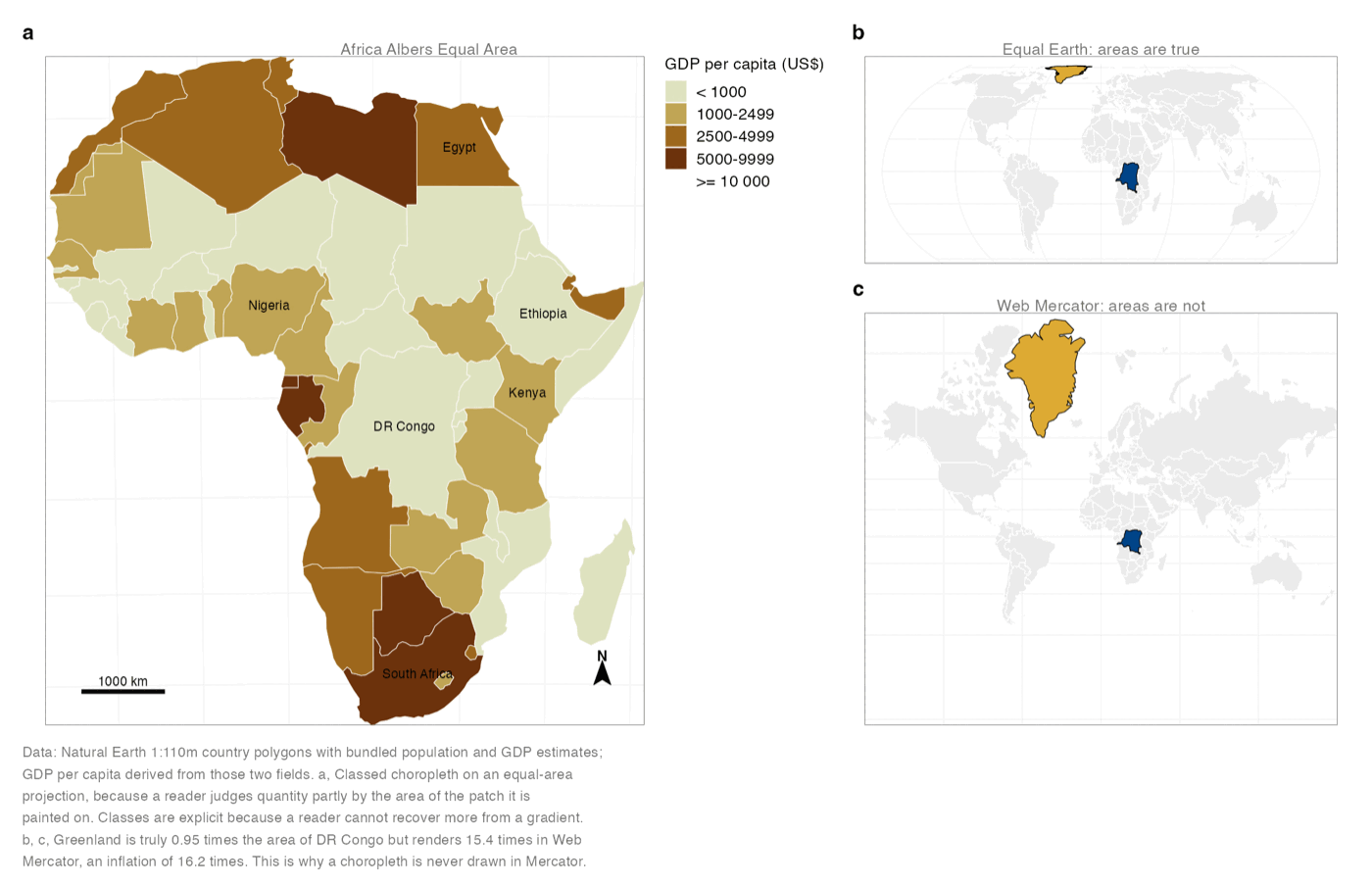
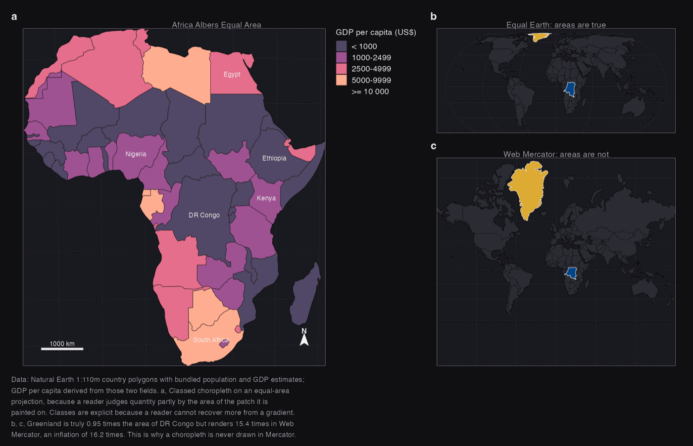
Why a choropleth is never drawn in Mercator.
A reader judges quantity partly by the area of the patch it is painted on. Greenland is 0.95 times the area of DR Congo and renders 15.4 times larger in Web Mercator — an inflation of 16.2×. The classes are explicit because no reader recovers a number from a smooth gradient.
Real data · Natural Earth 1:110m country polygons with bundled population and GDP estimates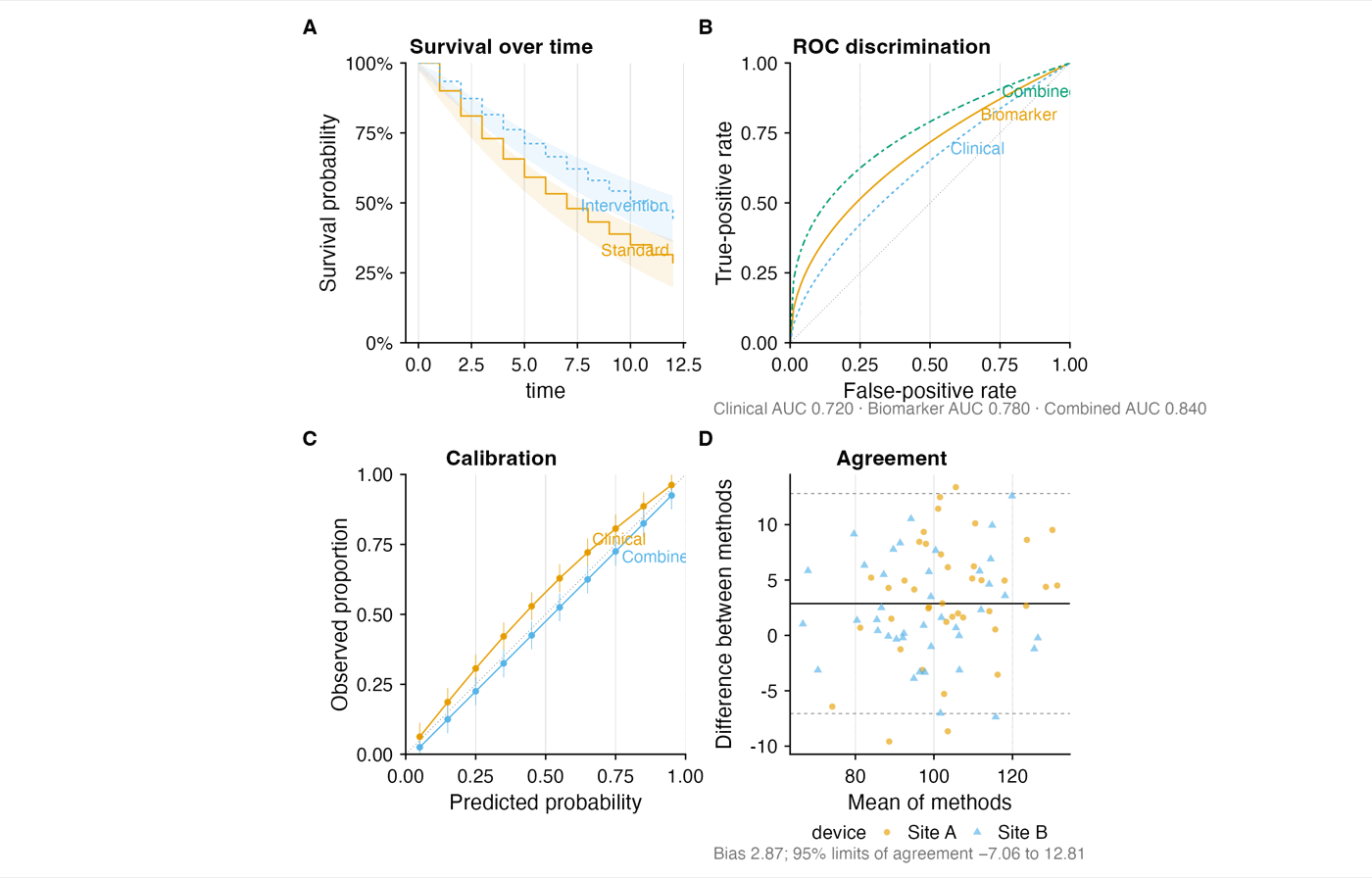
The clinical set, with its uncertainty drawn.
Kaplan–Meier with confidence bands, ROC with AUC stated rather than implied, calibration against the diagonal, and Bland–Altman with its limits of agreement printed. Every panel shows the interval it is entitled to show.
Synthetic demonstration data — these panels exercise the grammar, they do not report a study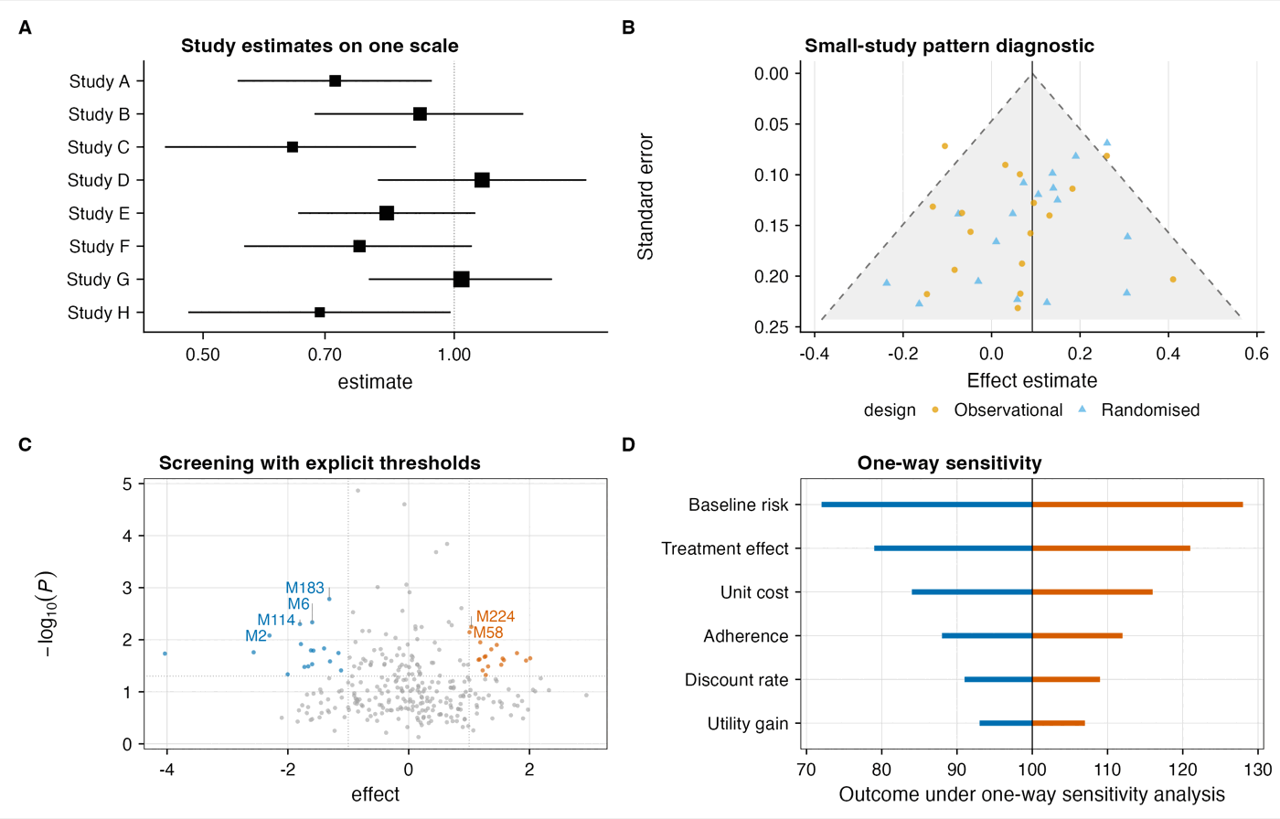
Where the evidence is thin, the figure says so.
Forest, funnel, volcano and tornado. The funnel carries pseudo-confidence limits so asymmetry is read against an expectation rather than eyeballed, and the tornado ranks one-way sensitivity so the parameter that actually moves the result is visible.
Synthetic demonstration data — study-level effects generated to exercise the grammar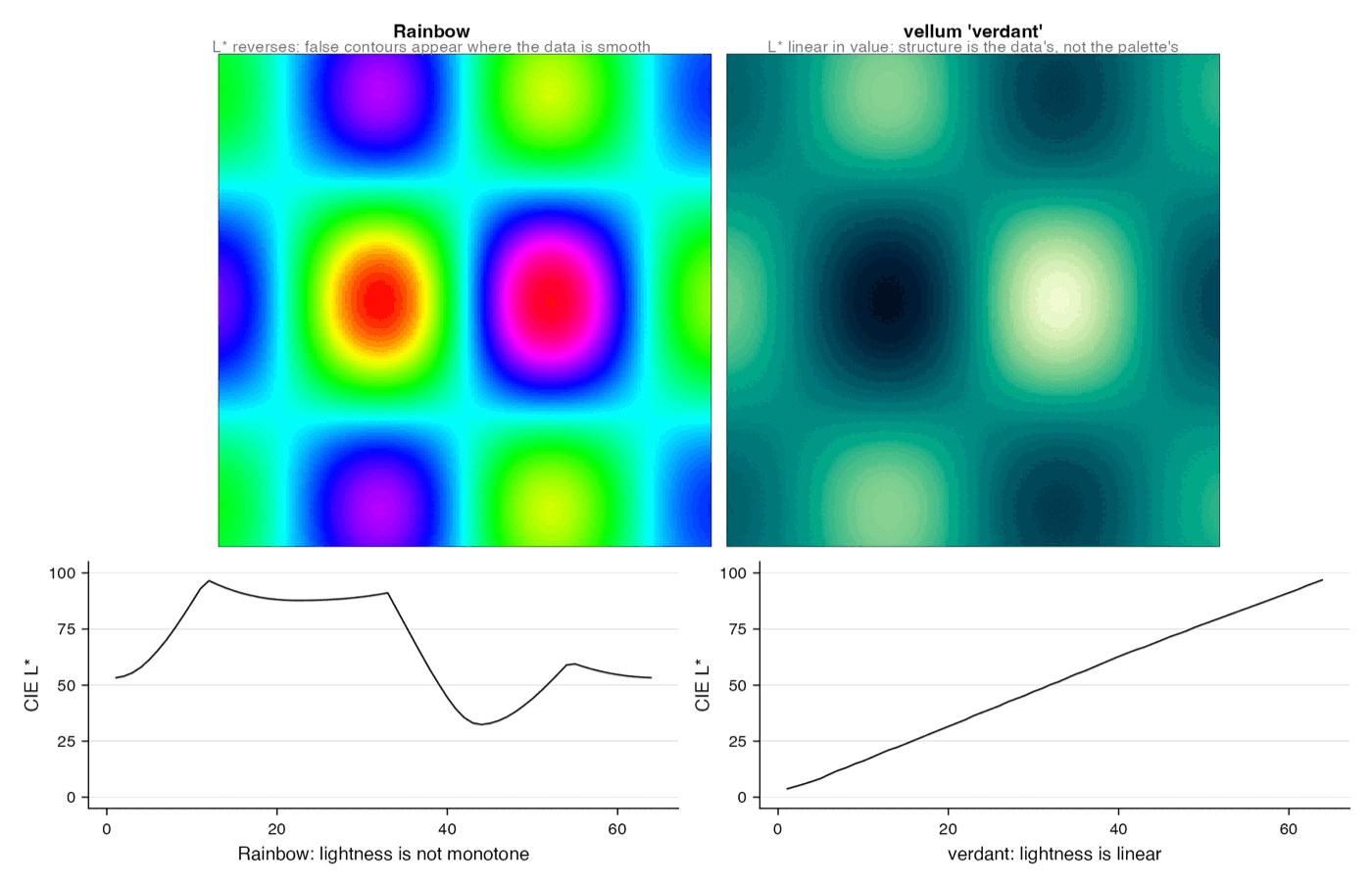
The rainbow ramp invents structure that is not there.
The same field, twice. A rainbow ramp is not perceptually uniform, so it creates false edges at yellow and cyan and flattens real differences elsewhere. The linearised ramp reports the field. This is why the palette is audited rather than chosen.
Method demonstration — a constructed field, shown to compare two encodingsSeventy-seven grammars, organised by the question they answer.
The toolkit treats charts as an extensible taxonomy of analytical questions rather than a menu of chart types. You do not pick a bar chart; you state the question, and the grammar follows.
What we will not do to a figure.
No uncertainty left implied
Intervals, bands and support get drawn. If a figure cannot show its uncertainty, it says so.
Colour is never the only channel
Position, direct labels and printed values carry the reading. Palettes are colourblind-safe and survive greyscale.
No truncated axes to inflate an effect
Baselines start where the measure starts. Where a zoom is genuinely needed, the break is marked.
Bring us a question.
We will tell you which figure answers it, what it can and cannot support, and what would need to be measured to say more.
Every form the engine draws.
One click on any figure turns the card over: what the form is for, and the trap it sets. Colour comes from the palette you choose, and nothing else changes between palettes.
Why the figures look the way they do.
Every principle here is demonstrated rather than asserted. Where two figures sit side by side, one of them is the mistake — and both are drawn in the palette you selected.